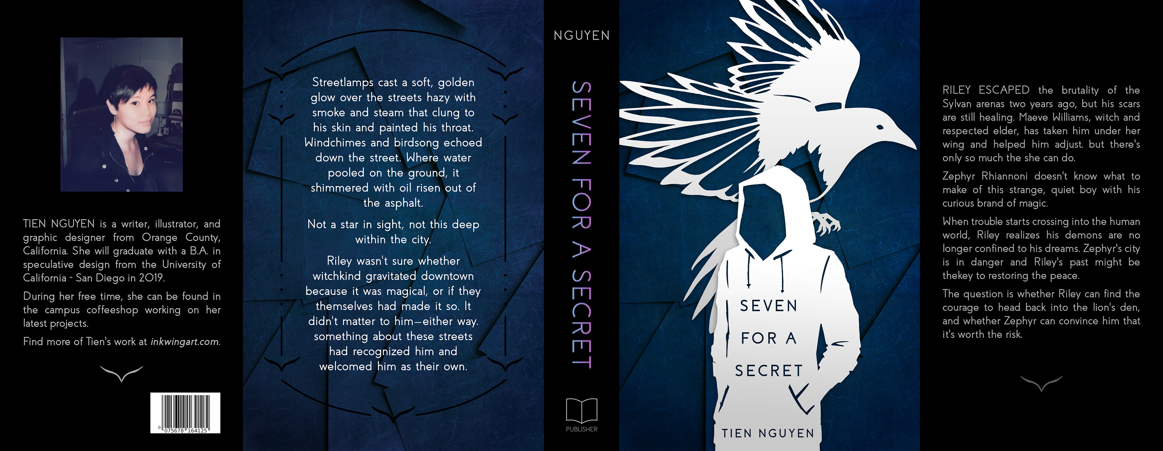
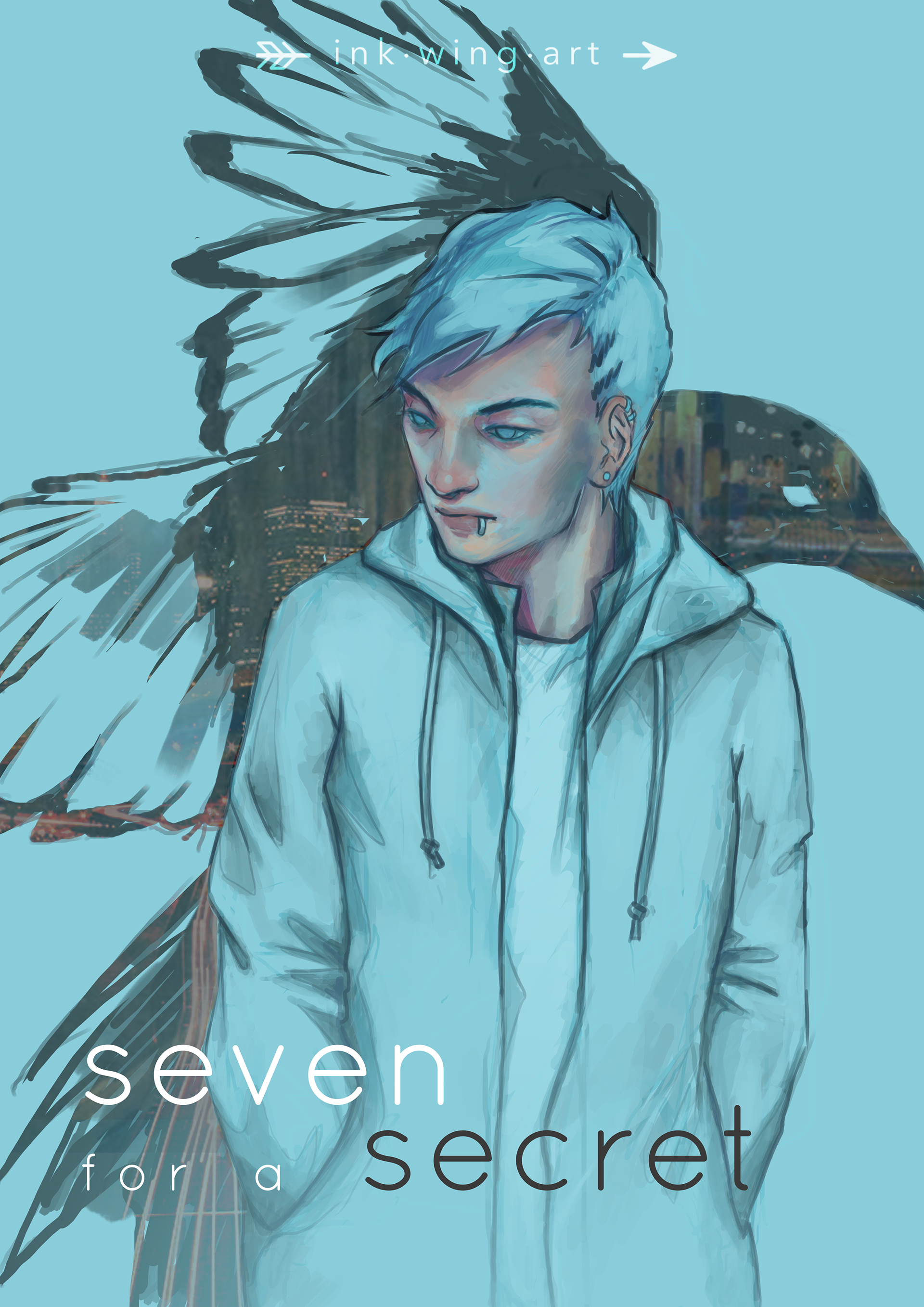
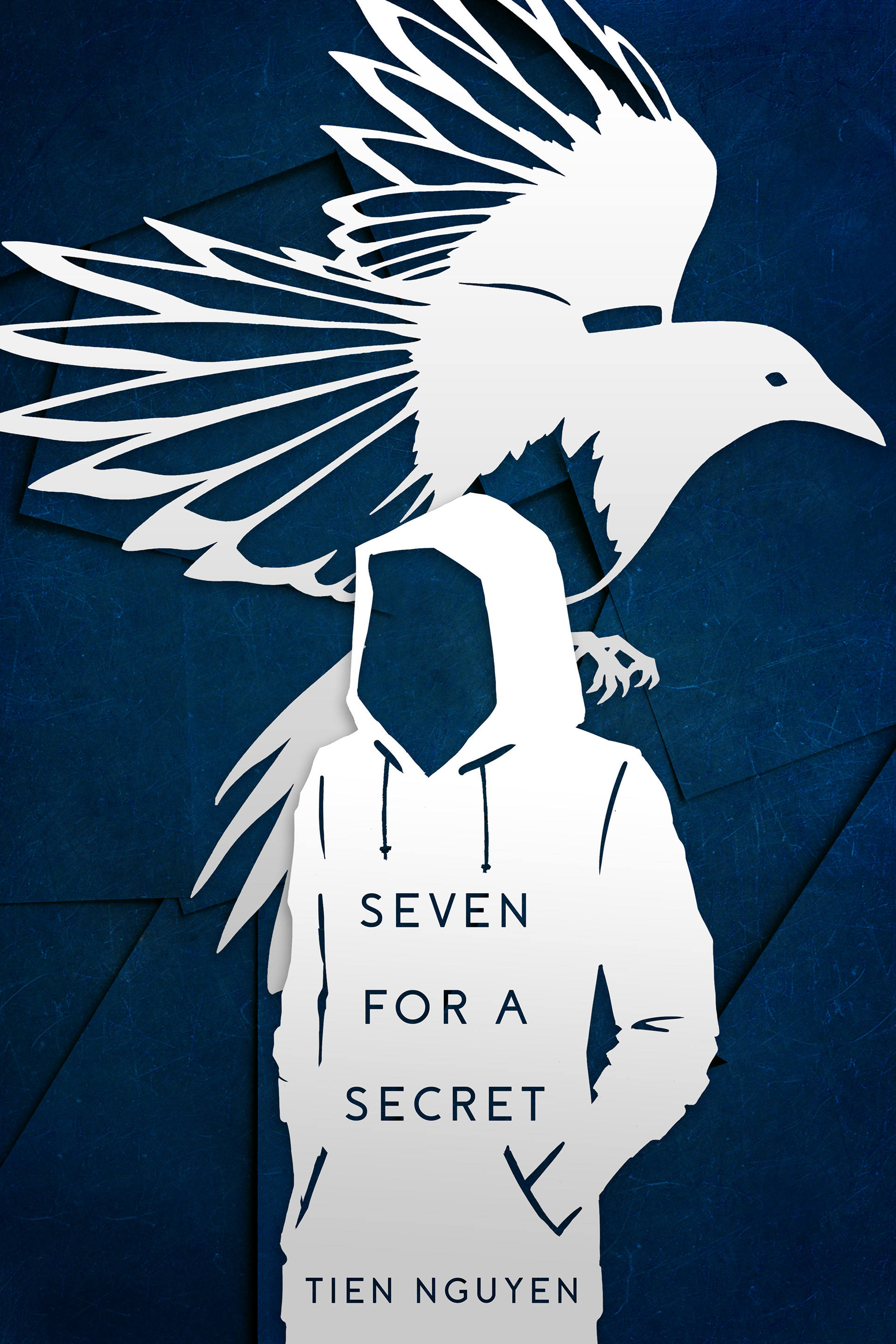
For this project, I was working from an old concept (left) that I wanted to revamp. I knew I wanted to keep the sketchy, organic aesthetic, but I also wanted something cleaner and more contemporary. I was set on keeping the silhouette in the background, since magpies are the inspiration for the title and protagonist. I chose a clean, simple color palette of pale greys, navy blue, and black which echo a magpie's coloring.
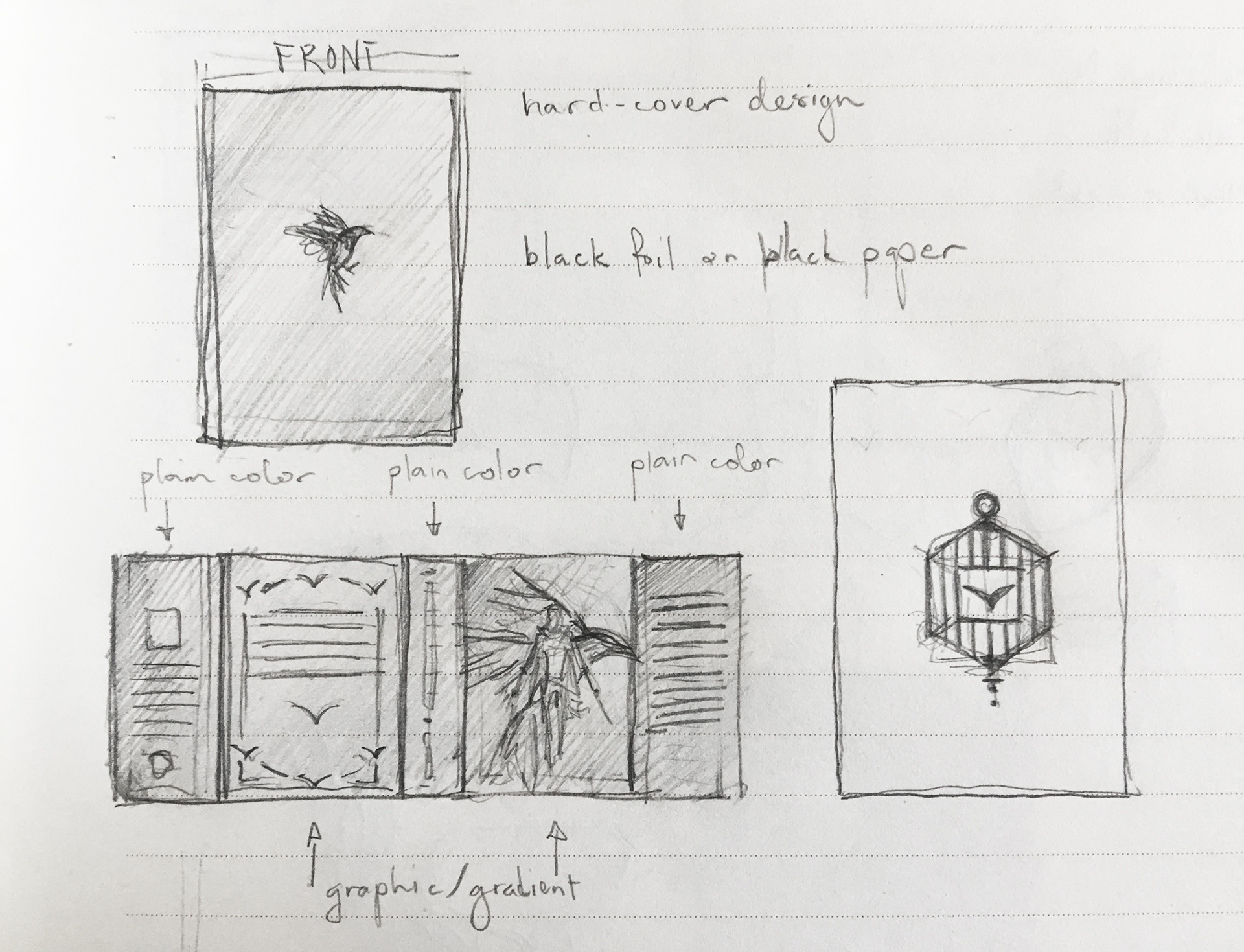
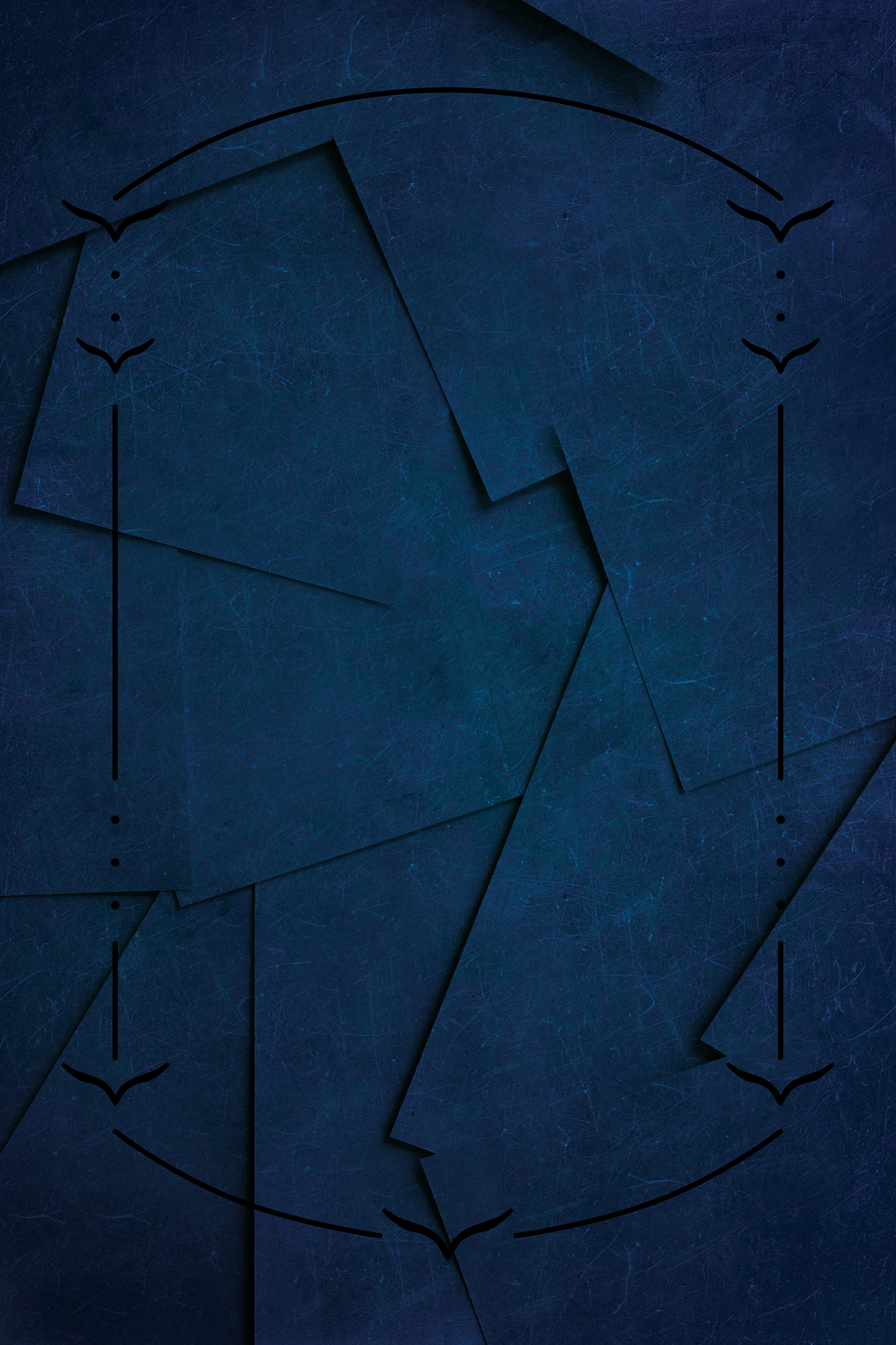
I started with a few thumbnail sketches and jotted down notes to give myself a better idea of the different elements I would need to create. For the framing on the back panel, I wanted something that incorporated the bird theme without being overwhelming, so I drew on the linear aspects of Art Nouveau design, and kept the details minimal.
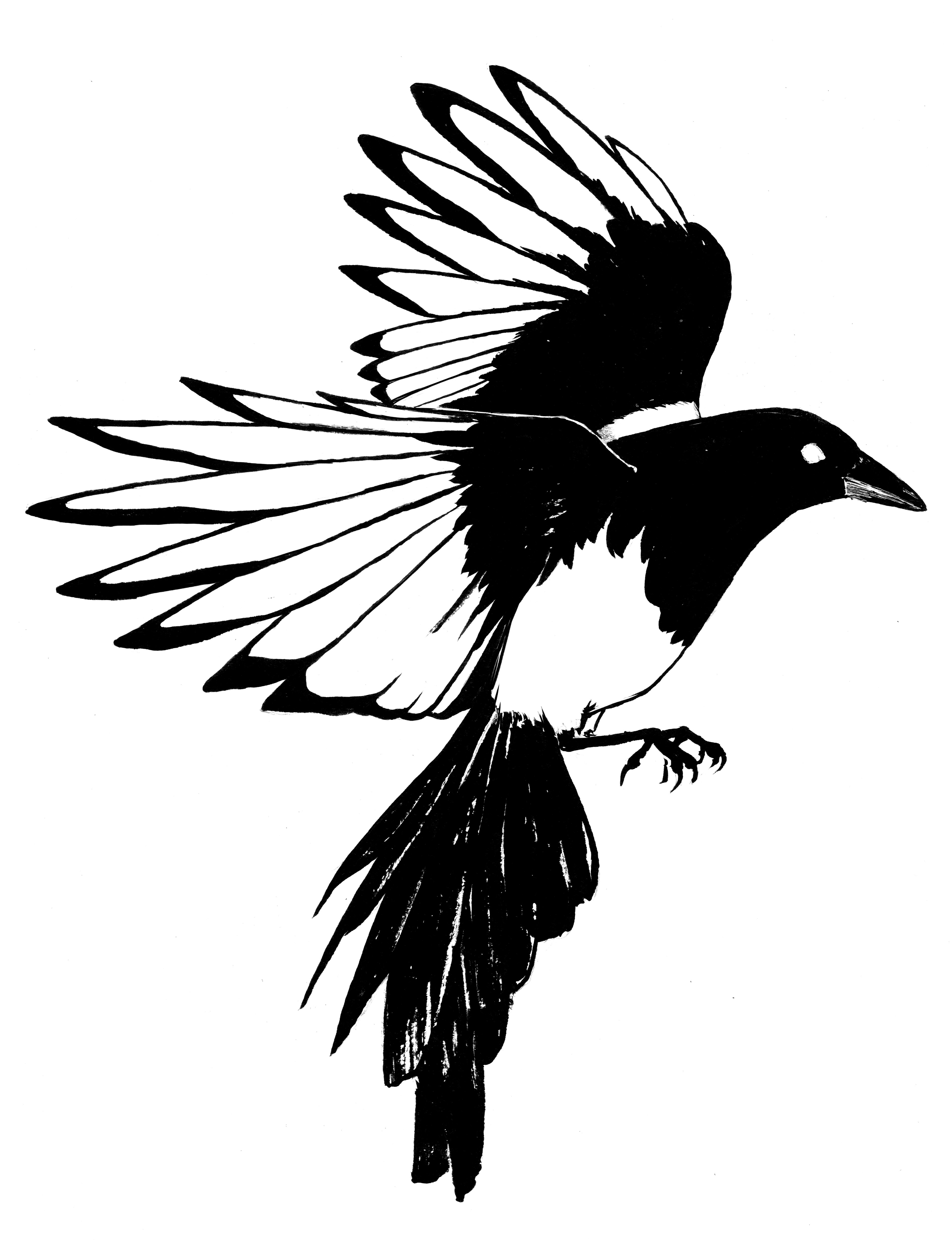
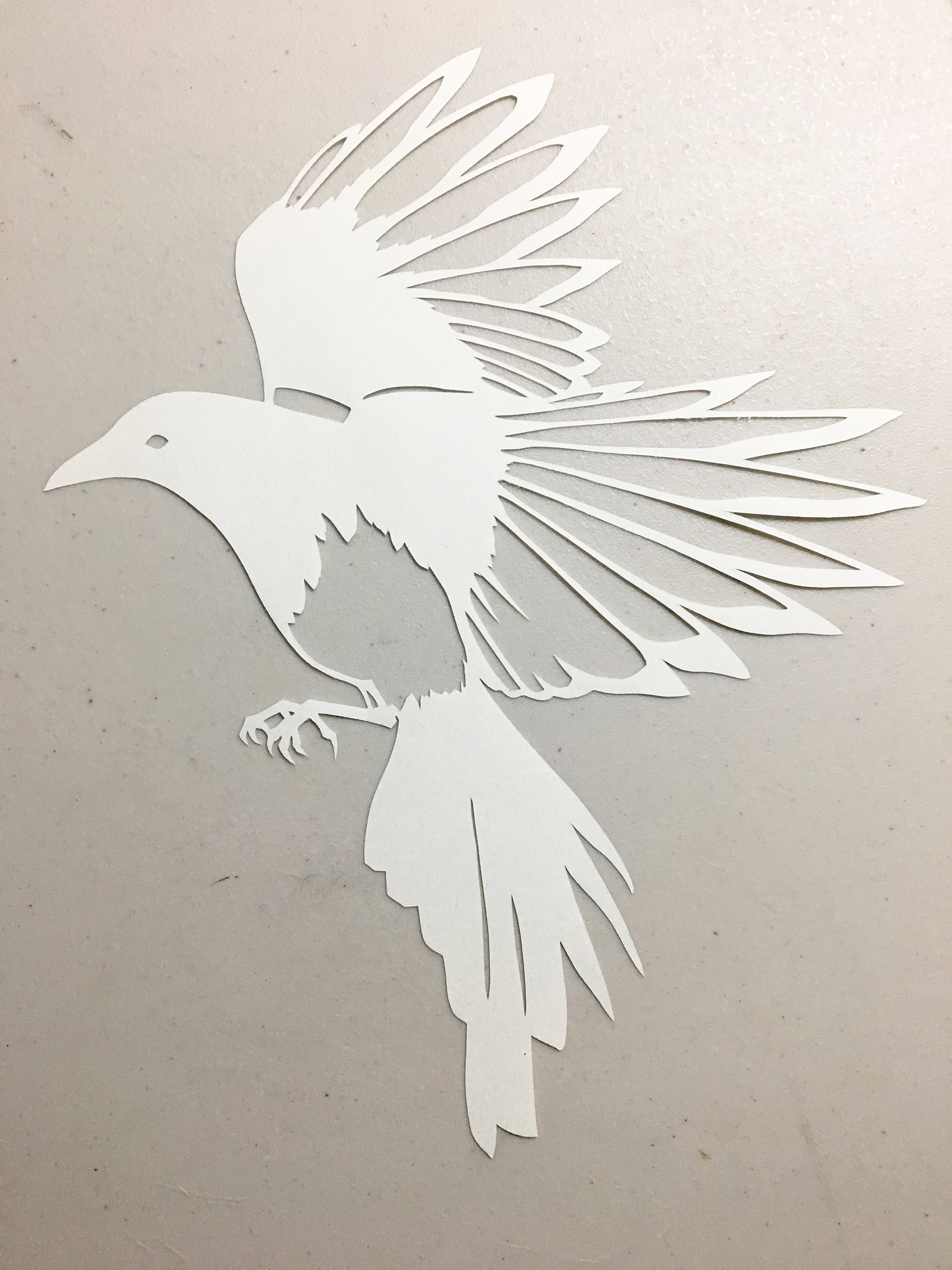
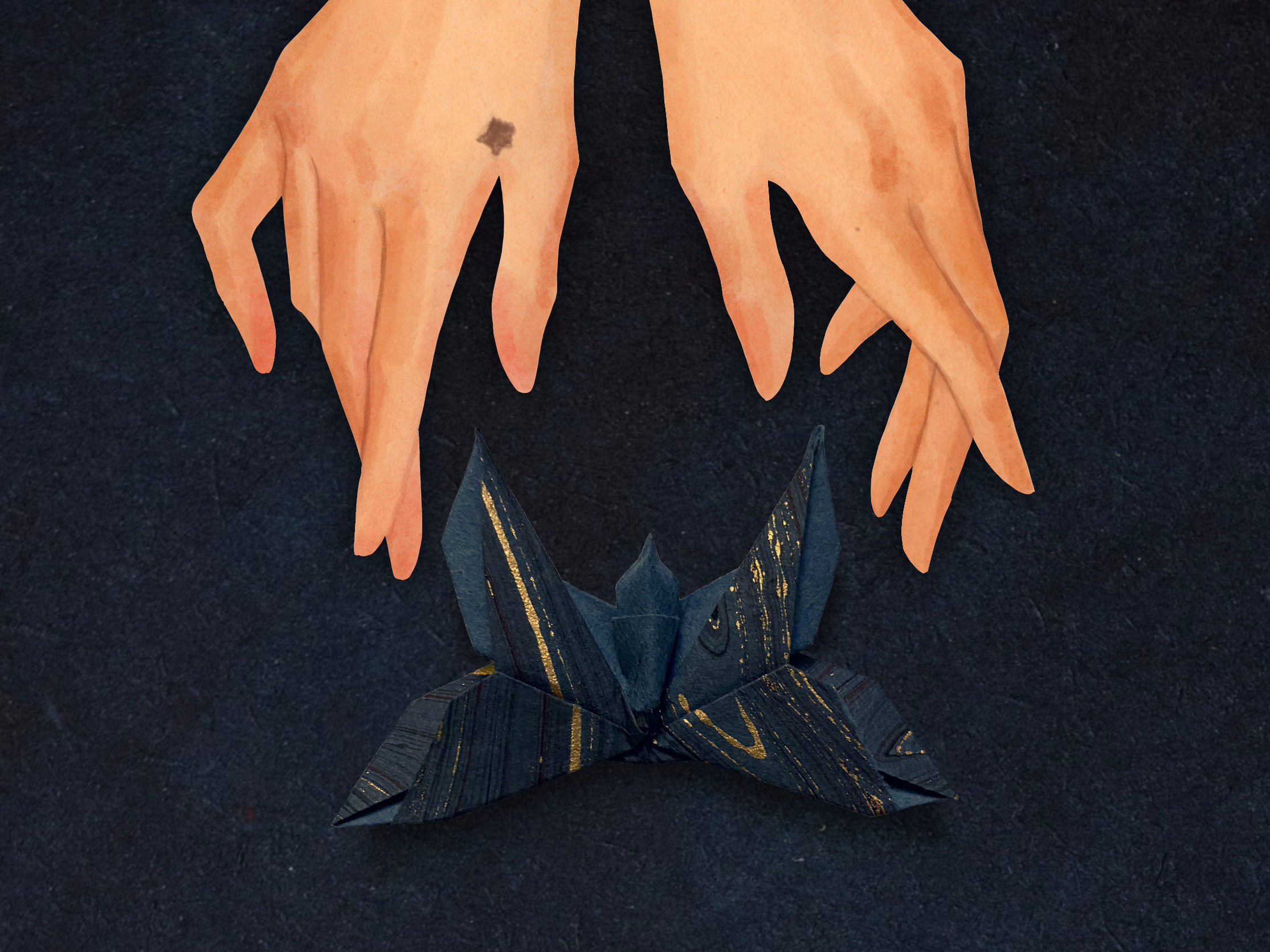
From there I drew a magpie in ink, which later translated to a paper cutout. For the central figure of the protagonist, I zoomed out and went with a solid silhouette to give a layered effect to the cover art.

I kept the framing black on the back cover to add visual interest without distracting from the text, and to increase the overall readability. For the spine, I mocked-up the title in a holographic foil that echoes a magpie's characteristic iridescent feathers.